Production of my film poster.
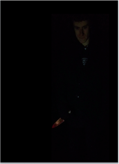
This is the original image that I used for my magazine cover and my film poster. I have edited the image so that it suits the dark background of each ancillary. The image is already dark, but as a key element of my production, the editing of my images was very important, and so by using Adobe Photoshop, I edited my photos. I had to brighten certain aspects of the images, also the contrasts between the photos was important because it showed the different blends of colour within the photo and the background colour.
As you can see in the above images, the original copy of the image is slightly brighter than the final image on the finished product, this is because the blending of the colour, contrasted better with the other colours from the other images that I have used on my poster. Also, because the background image is so dark, The image itself being slightly darkened, helps the contrast of the image. |
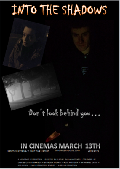
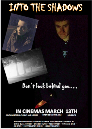
This is my final product for my film poster. I have used 3 images, 1 main and 2 smaller images. The font that I have used is similar and it follows the pattern from my film trailer itself and the magazine cover. When creating the poster, I was unsure on the colours to use for my text as I wanted it to be scary but at the same time not too cliché so therefore, I thought that the grey font was a good choice, and it also blends well with the images that I have used and the dark background colour.
|
In terms of continuity in my media production, I decided to use the same main image for my film poster as my magazine cover. The image is of the main character in the film, the killer. The image is dark and mysterious and so therefore will hopefully draw the audience in so that they are more attentive.